Compensation Reviews
Role: Lead Product Designer
Company: ChartHop (Series B startup)
Team: PM Lead + me + UX Research Lead + 2 designers, CX SMEs, 4 Eng Leads, 20ish engineers
Timeline:
- Discovery Feb 2022
- Alpha Aug 2022
- GA Oct 2022
Impact
Leading with empathy to reimagine compensation reviews
$2.3M ARR in the first year.
Implementation time dropped from 8–12 weeks to 3–4 weeks.
Launched Q3 2022, giving existing customers time to onboard and new prospects to start cycles by early 2023 — a meaningful boost to end-of-year sales conversion.
Established new R&D ↔ Customer Experience feedback loops, improving trust and reducing turnaround time on product enhancements.
Summary
A compensation review is the annual or semiannual process where managers look at employee compensation and decide who merits raises and/or promotions (based on any number of factors and balanced against budgets).
ChartHop’s compensation review product demoed well in the hands of an expert sales rep, but in practice was anything but user-friendly. It was hard to meet basic user expectations without a lot of manual effort and supporting more complex needs was error-prone and fraught. Customers needed to sign up 3 months before their review cycle was to start because even a simple cycle required 8–12 weeks of intensive support from our CX team to set up. It was expensive: on top of fees for one of the core ChartHop packages, a customer needed to pay an additional $2 per employee per month for comp reviews while also shelling out $10k–$15k or more in implementation fees every time they ran a cycle. It was expensive to deliver, hard to sell, and genuinely painful for the people actually using it.
I led design on a full reimagining of the product — a large initiative with multiple engineering teams, globally distributed, on a timeline tied to annual comp cycle seasons.
Problem/Context
Two user groups, owners and reviewers/approvers, both having a bad time.
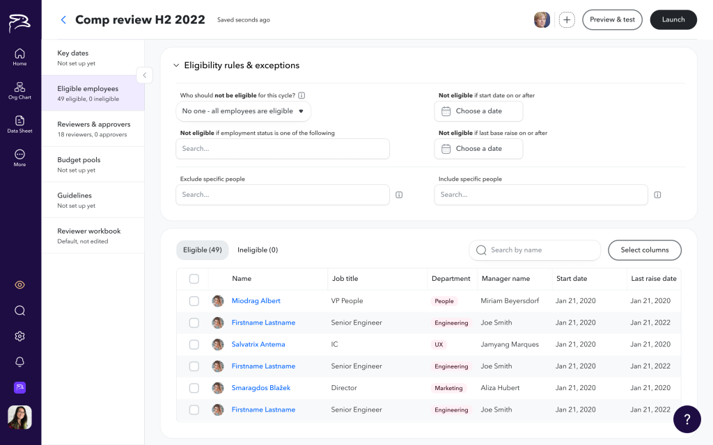
Owners, typically an HR team of one, were responsible for everything: planning, configuring, launching, monitoring, and closing out the cycle, then getting compensation changes into payroll.
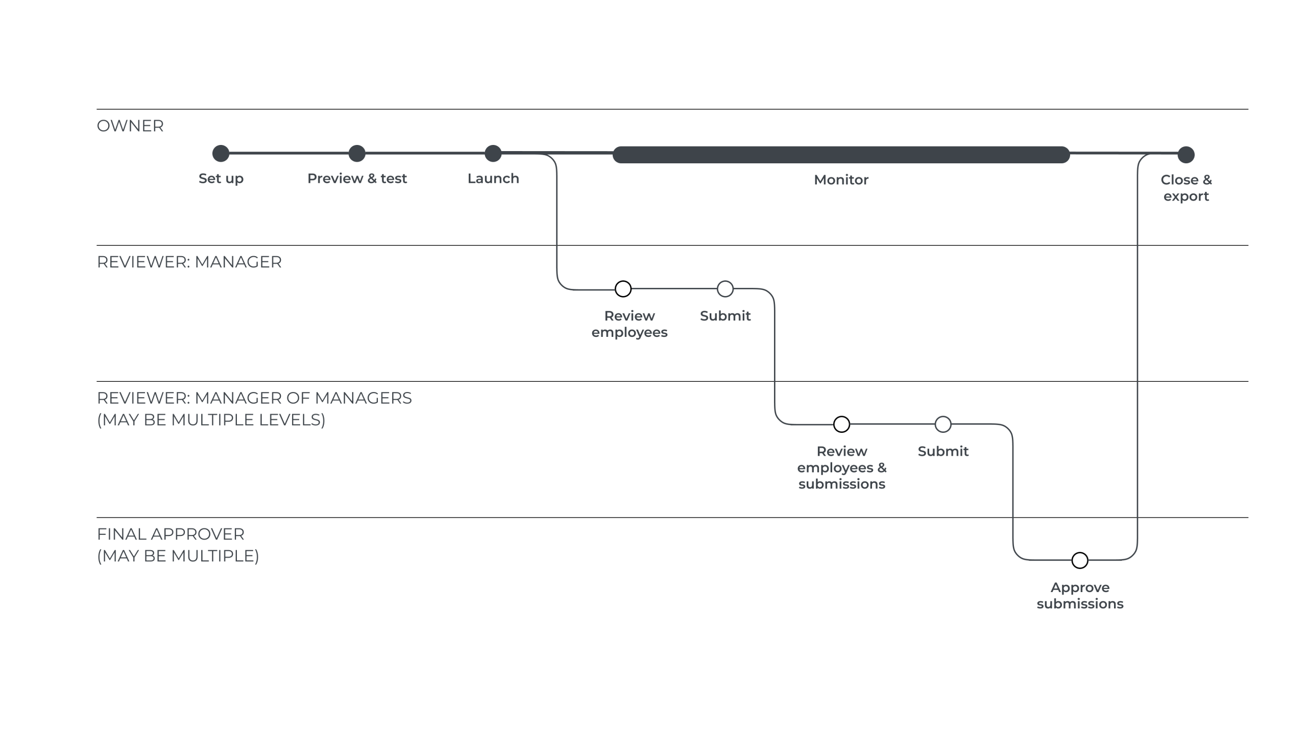
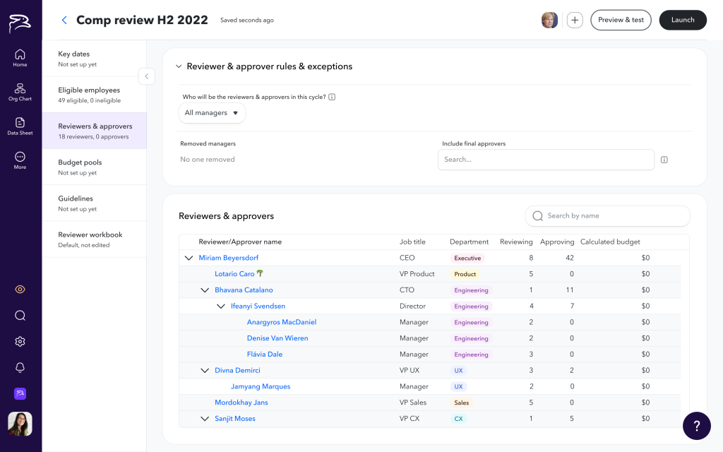
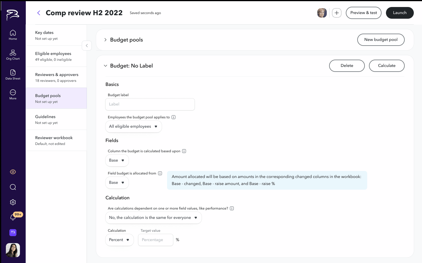
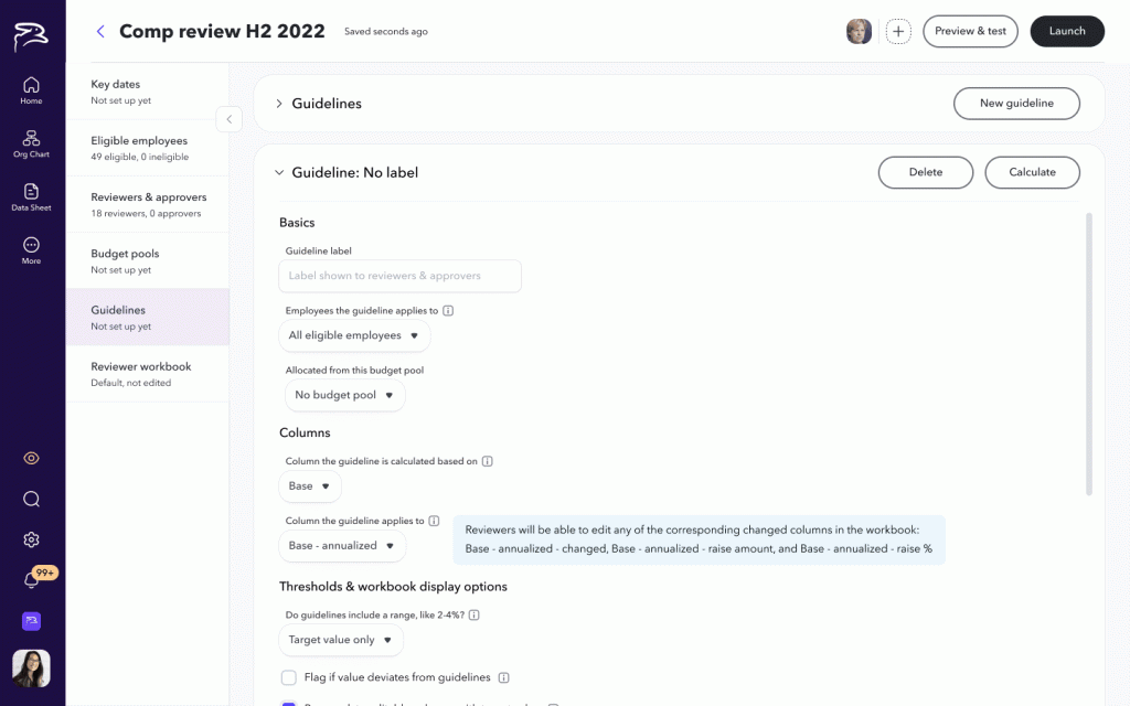
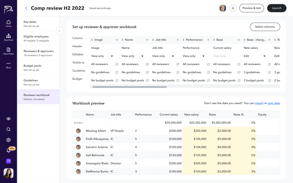
Setting up a cycle was tricky. Owners wanted to specify the cycle timelines/deadlines, who’s eligible, who’s reviewing who, who’s approving recommendations, what budgets look like, what rules should reviewers follow to determine raises, and what data reviewers see to determine their recommendations. The old system required a lot of manual effort to accomplish these things, often necessitating writing long paragraphs of rules in our proprietary query language.
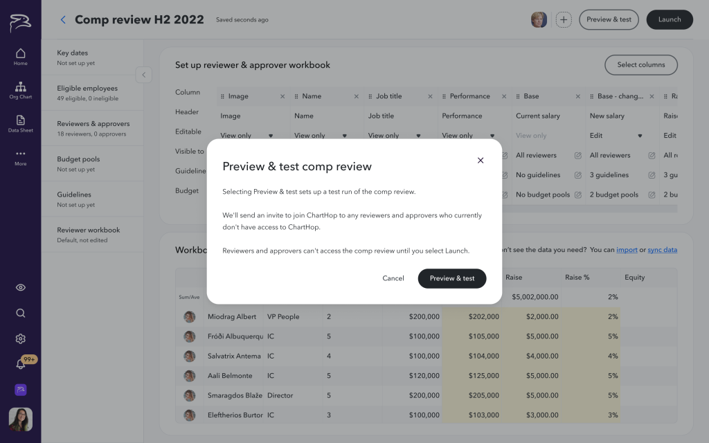
Before launching a cycle, users wanted to test calculations and preview what reviewers would see during the cycle to make sure everyone was seeing what they should (and nothing they shouldn’t). To do this in the old system, they needed to remove sharing permissions for everyone in the approval chain so they wouldn’t be prematurely notified the cycle was open, then launch the cycle secretly, then use unrelated “preview as a different user” functionality to see what reviewers would see.
Launching, monitoring, and facilitating a cycle was super stressful for our users. Our system added a bunch of manual work to this stress, for example requiring the owner to manually invite managers to review their employees. It also didn’t gracefully handle org changes (departures, restructures) that are entirely likely to occur at some point during the review cycle.
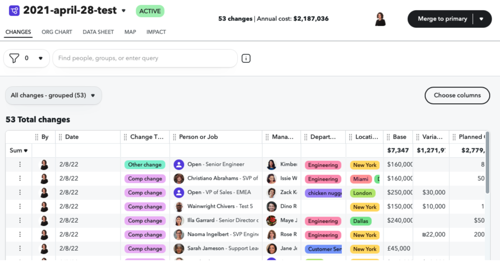
After the cycle, it was a pain to get the data out of ChartHop and into their payroll system.
Reviewers & approvers — most or all managers in the org — found the experience unintuitive enough to require training before every cycle. Given that they do this once or twice a year with months between, that’s a real ask on top of an existing workload.
How might we better support all users involved in a compensation review and also streamline operations for our internal teams?
The Solution
I was lucky to have a dedicated UX Research Lead on this one. We ran proper discovery — user interviews, SME interviews, analysis of customer spreadsheets and previous cycles, support tickets, and competitive research — while running ideation in parallel to keep pace with the timeline.
Building a deep understanding of and empathy for our users was key. Here’s some of what we uncovered:
Owners days are generally interrupt-driven. They are typically corralling information from multiple sources that arrives at different times in order to set up and administer a cycle (e.g. they’re waiting on Finance to finalize the budget for Marketing’s bonuses).
There were common patterns in how they thought about which employees would be eligible for a cycle and who should review employees (typically their direct manager) but there were also frequently exceptions to the rules. There are almost always budgets involved and they often break down by manager, team, department, or location. To keep reviews equitable, they want to provide relevant information and guidance to reviewers on who qualifies for a raise or bonus and how to determine raise and bonus amounts (they usually do these calculations in a spreadsheet with, for example, performance rating x min/target/max raise amount). They have enough on their plates without having to manually herd cats to get reviews done on time, so automating notifications could be a kindness.
Reviewers needed relevant context to make good decisions, clear guidance on budget, and an easy way to flag exceptions. They didn’t want to have to “learn a system” to accomplish this key, but infrequent, part of their job. They were doing this on top of their existing workload so might need to dip in and out before getting their reviews finished.
Based on this, early on, I built out shared principles that would guide cross team effort:
Allow user to dip out of set up process & resume.
Do things automatically when we can.
Set defaults based on best practices and common patterns.
Allow for infinite customization but don’t let that harm the 80% use case experience.
Through ideation into design, we discussed scope and approach with PM & Eng folks, validated ideas with SMEs, iterated rapidly, and did user validation all along the way. Because timelines were so tight, we were cutting scope right and left, so keeping a coherent vision across the project was key. We also were designing things out of sequence with the user flow due to engineering scheduling so we needed to have our story straight.
Keeping four teams aligned across time zones
With engineering teams from Amsterdam to California and implementation starting as soon as early designs were ready, I was simultaneously supporting in-flight implementation, iterating on current designs, and kicking off ideation for what was next. A single shared Figma handoff page organized by user workflow (not team), recorded handoff sessions for async access, daily Slack updates on design changes, and weekly user acceptance testing with the full ChartHop team kept us in alignment.
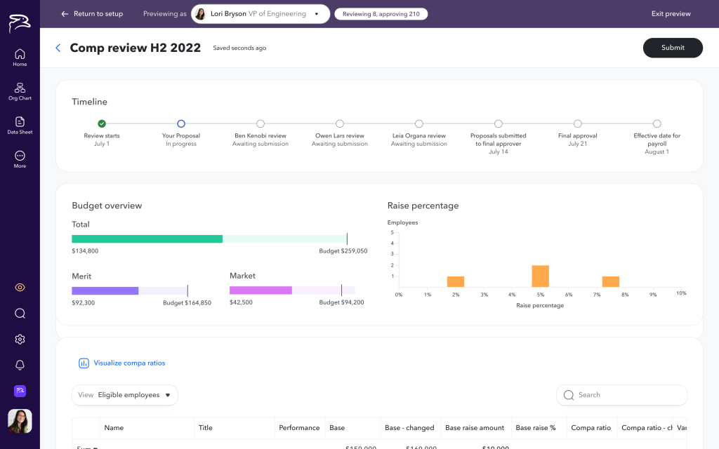
Final designs: For owners, lean into empathy
We designed for the interrupt-driven reality of the owner role: partial setup, easy resumption, late-arriving data (e.g., if Finance is late providing budgets), and proactive notifications when something required action — like a reviewer departing mid-cycle.
We baked in common use cases and allowed for custom rules that could be as complicated as needed. In context live previews of calculations and reviewer worksheets streamlined the setup experience.
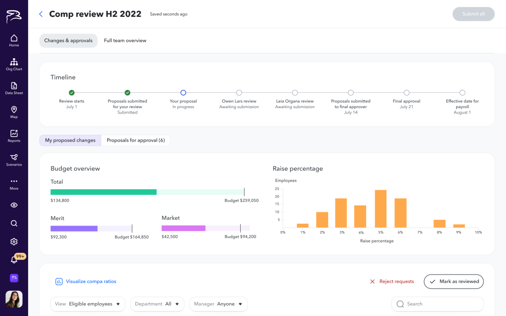
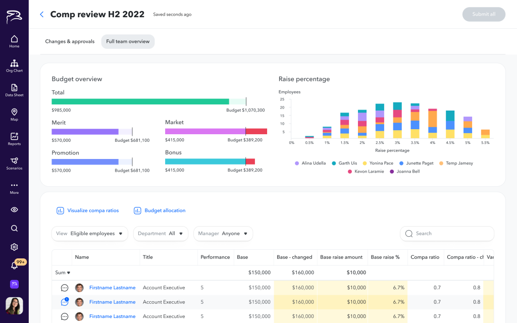
During the cycle, we gave the owner all the information they needed, all in one place. Automating notifications to reviewers was a no-brainer and significantly reduced owner workload during the cycle.
After the cycle, the owner could now just click the Export button to grab comp changes.
The features I’m proudest of — and had to advocate hardest for — were preview-and-test mode and the ability to pause a live cycle and make adjustments. Before this, it was painful at best to verify before launching that reviewers at each level of the cycle saw the right data, that calculations were correct, or that budget allocations made sense. Giving them a safe sandbox to test before launching, and a pause button when something went wrong mid-cycle, reduced anxiety around comp reviews more than almost anything else we shipped.

Final designs: For reviewers, dead easy, in context
Pre-populated recommendations based on the owner’s guidelines meant managers weren’t calculating from scratch. Context they needed — performance history, last raise, budget position — was surfaced in-line rather than requiring them to root around in ChartHop or turn to other systems. When a recommendation fell outside guidelines or budget, we flagged it clearly but non-judgmentally, making it easy to document reasoning for exceptions. For managers of managers, we made the distinction between reviewing their own reports and approving others’ recommendations explicit — a consistent source of confusion in the old product.

What I’d Do Differently
When you’re running at full speed, sometimes you don’t get the visual design to the level you’d like. In this case, the left side tabs in setup still bug me. The design team workshopped them a couple times but they still feel a little clumsy to me.
Ask Me More
Happy to dig into any of this further — process, how we came to the design decisions we did, scope discussions, coordinating across four engineering teams, or anything else of interest.